Population Pyramids Overview
-
Visually represents age and gender composition of a population with horizontal bars, and a center line.
-
The horizontal bar displays percentages of each age group in the total population, and its length represents its share.
-
Males are on the left side of the center line and females are right of the center line.
-
These visuals can show the demographic situation in a country
-
Can see dependency (old people dependent on young workers, and/or young people dependent on workers also.) with population pyramids as well

Notice that there are going more older people because the the middle bulge moving up. Currently there are less children, so younger people will have to support the dependent older people later on. The lower numbers of people under the age of 30 represents a movement towards family planning, which connects to the DTM. These factors combine and represent an MDC.

This population pyramid shows the population of Kenya in the 1990s. There are many younger people/children, and not very many older people. This represents a high birth and death rate, something common in Stage 2 of the DTM. Infant and child mortality is high, because the number of children aged 5-9 is much smaller than those between 0-4. There is a low life expectancy, which is shown by the small percentage of the population aged over 65. These factors show that Kenya is an LDC.

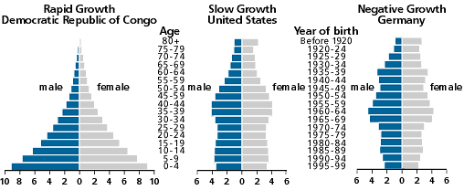
These population pyramids show the four basic shapes and what they can tell us about the country being graphed. To remember the shapes, remember this.
Wide base + narrow tip = Rocket (Population is "shooting up")
Even base and midsection + narrowing tip = House (Family planning has been established, population is not growing)
Narrow base + wide midsection + narrowing tip = Stop sign (Negative population growth; population has "stopped")
Some examples of countries and their population pyramids are shown below.
